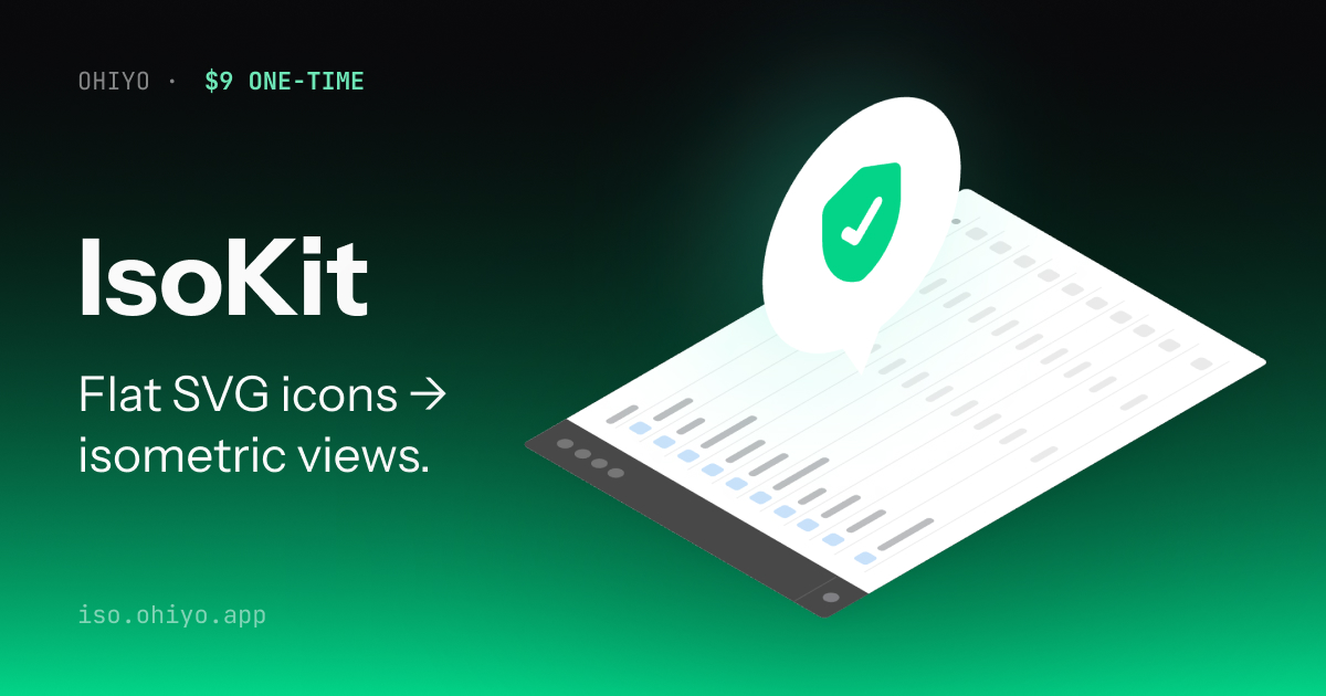
How to make SaaS-style isometric graphics from flat SVGs
You're building a landing page, a pricing section, or a feature card. You need one of those polished isometric graphics — a laptop with a slight 3D lean, a cube floating with a soft shadow, the kind of visual Linear and Stripe put on their feature cards.
Doing this in Figma means fighting with rotations and faux-3D plugins. Doing it in Blender or Vectary means learning a 3D tool for a 5-minute job. Grabbing a stock illustration locks you into someone else's style.
Here's a faster path using IsoKit — drop a flat SVG, pick an angle, drag onto a canvas, add depth and shadow, export. No 3D software, no stock photo license, just your icon made iso-ready.
Who this is for
This guide is for indie makers, SaaS founders, and landing-page designers who need a small polished iso graphic and don't want to learn Blender for it.
IsoKit isn't meant for complex scene illustrations (city streets, office interiors) — that's Vectary and Blender territory. It's for one-to-three object compositions that sit inside a card or hero section.
The old workflows, and why they slow you down
Typical approaches
→ Figma + manual skew: tedious, never quite right
→ Blender / Vectary: overkill for a feature card
→ Freepik stock: licensing, style mismatch
→ Iso Figma plugins: fixed camera, no edit after
→ AI image tools: raster, hard to match brand color
IsoKit
→ Any flat SVG → pick from 6 angles
→ Drag to compose, not a one-click black box
→ Thickness & shadow effects built in
→ Vector SVG output (scales, stays crisp)
→ Free to preview, $9 lifetime for vector
Step-by-step: make an iso graphic in 2 minutes
1. Drop a flat SVG
Open iso.ohiyo.app and drag a flat SVG into the sidebar. Simple icons work best — a laptop, a box, a credit card, a rocket. Filled icons render better than outline-only ones because the 3D effect needs solid shapes to extrude.
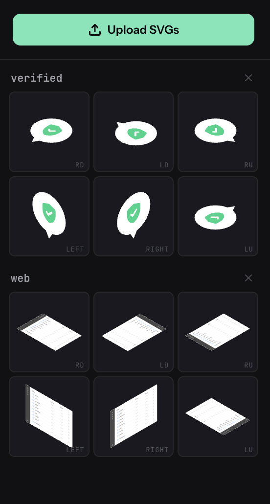
2. Pick an angle and drop it on the canvas
Each uploaded icon splits into 6 isometric faces automatically: four "top" angles (looking down from different corners) plus a "left" and "right" face. Click the thumbnail you want — it appears at the canvas center. Or drag it and drop where you want.
3. Resize and position
Drag the element to reposition. Pull any of the four corner handles to resize proportionally. Click a different face in the sidebar to add more elements — you can stack 2 or 3 for richer compositions (a laptop with a floating cube beside it, for instance).

4. Add thickness for 3D depth
With an element selected, the floating toolbar above it shows three chips: None / Thick / Shadow. Click Thick and the object gains extruded depth along its face axis — top faces extrude downward, side faces extrude into the scene. Dial the amount up and down with the minus/plus buttons.
This is the effect that makes flat icons look like solid 3D objects without actually modeling them.

5. Or use Shadow for floating, polished objects
Toggle Shadow instead of Thick when you want the element to feel like it's floating above a surface — useful for UI cards, floating feature tags, icons that shouldn't look chunky. The shadow direction follows the face orientation automatically. You can also change shadow color for a glow effect — try a mint or light color.
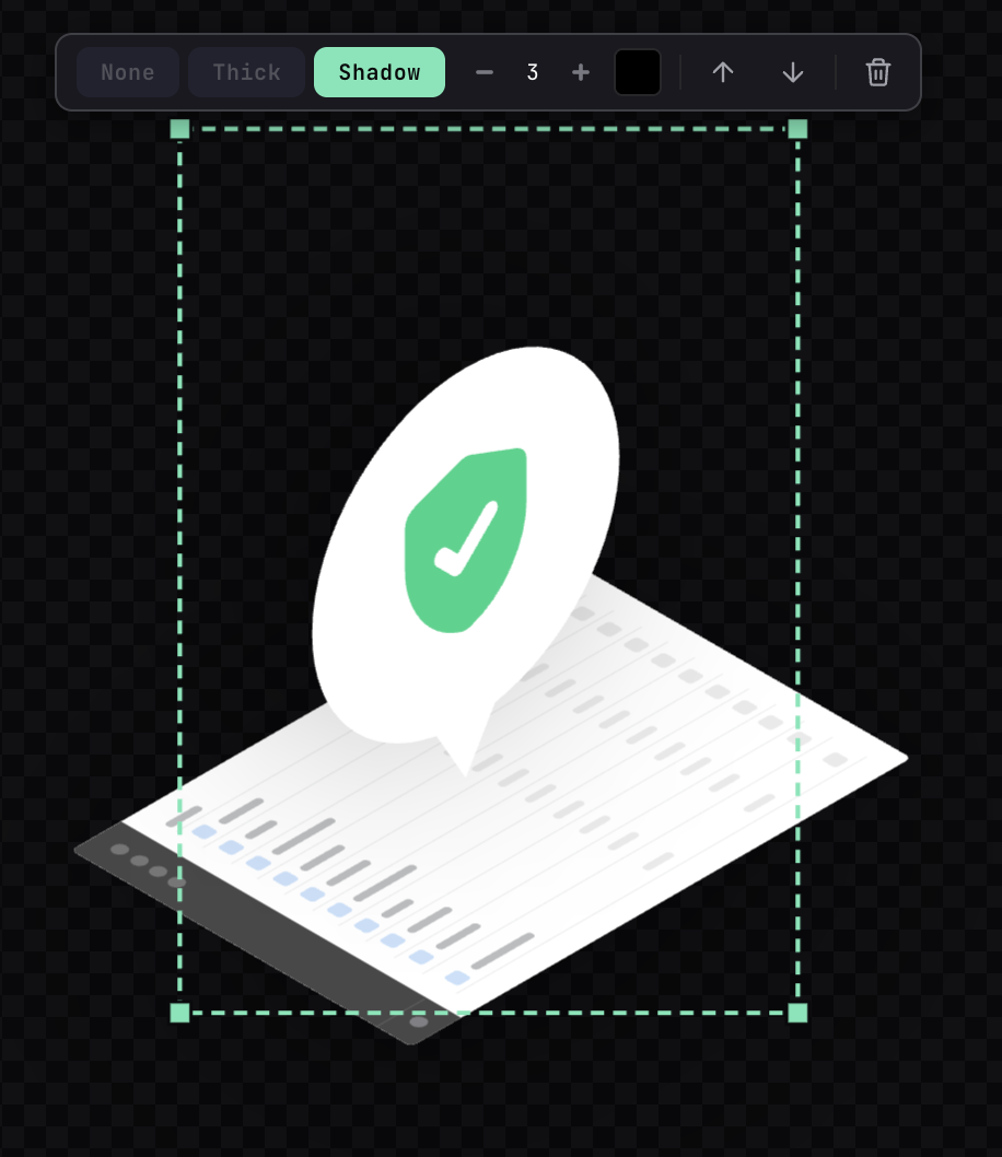
6. Layer, reorder, undo
Click any element to select, use the forward/backward arrows to change its z-order. Ctrl+Z undoes anything. The canvas background toggles between dark and light — useful to see how your graphic reads on both light and dark landing pages.
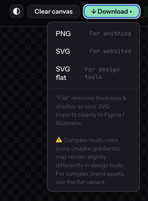
7. Export
Hit Download at the top right. Three formats cover different workflows:
- PNG (free) — renders all effects, works everywhere. Use for quick mockups or when vector isn't needed.
- SVG (Pro) — vector with thickness & shadow baked in. Use for direct web embedding (React, HTML, static sites) where you want crisp rendering at any size.
- SVG flat (Pro) — clean vector without thickness/shadow. Use when you plan to re-edit in Figma or Illustrator.
One honest caveat: SVG with effects imports fine for direct use, but re-editing the stacked thickness geometry in Figma can be fiddly. If the SVG is destined for design-tool editing, pick SVG flat and add your own effects there. Complex multi-color icons with internal masks or gradients may also render slightly differently in design tools.
Mix angles & effects for richer compositions
The same icon gets 6 isometric angles in IsoKit. You don't have to pick just one — combining two or three angles with different effects creates visual variety that a single iso object can't match.
A common pattern: drop the same icon twice, pick different faces (say Top ↘ and Right), then give one Thick and the other Shadow. The thick one anchors as a "solid object"; the shadow one feels like it's floating nearby. Instant scene with depth and hierarchy.

Try this with different icon pairs: laptop + cube, rocket + package, shield + check. The effects contrast makes the composition read like a small illustration rather than a flat icon set.
Thickness or Shadow — which one to use
Quick rule of thumb when you're deciding:
- Landing page hero graphic → Thickness (readable from far, makes a strong visual)
- Feature card icon → Shadow (lighter, less busy, sits well in a card)
- Pricing card decoration → Shadow with a subtle mint or brand color (gives a gentle glow)
- Technical diagram object → Thickness (reads as a concrete "thing", not a floating icon)
- Dashboard empty state → Shadow with low intensity (quiet, doesn't fight the UI)
If unsure, add both elements and toggle between modes — the change is instant, decide by eye.
Why vector SVG matters for landing pages
PNG is fine for quick mockups, but for a real landing page you almost always want vector SVG:
- Stays crisp on retina displays and any zoom level
- Tiny file size — most iso graphics export at 5–30KB
- You can edit colors later in Figma or directly in the SVG
fill=attribute - Drops straight into a React component as
<svg>JSX - No compression artifacts when a CDN touches it
That's why IsoKit's $9 Pro unlocks vector export — it's the format that actually ships to production.
About the pricing
Free gives you the full editor and PNG export at 2000px. Pro is $9 one-time for lifetime vector SVG export. No trial, no monthly fee, no hidden tiers.
7-day refund, no questions asked. If the tool doesn't fit your workflow, email support@ohiyo.app and get the $9 back.
Related tools
IsoKit is part of Ohiyo — a small set of browser-based SVG tools for indie makers:
- AutoKit — drop an SVG, get entrance and loop animations instantly (CSS, no JS needed)
- Animated isometric icons — use IsoKit + AutoKit together to make animated iso graphics (with demo video)